Research suggests people make up their mind within 90 seconds after the initial interaction with the brand and associate it as either bad or good. Many podcasters only focus on the podcast's content, which they should, but ignore the visual identity of the podcast.
In this guide, we will guide you to design a stunning and unique podcast cover. But before that, we will acquaint you with all the necessary elements of an eye-catching podcast cover image.
In this article
Round-Up 10 Tips to Design Podcast Cover Art
These are not tips but 101 guides on podcast cover-making. All the ten key points mentioned here will enable you to create a podcast cover image that stands out and catch the user's attention.
1. Make sure the podcast cover meets podcast platform requirements
To make your podcast accessible to people worldwide, you have to publish them to podcast platforms, otherwise known as podcast directories. For instance, Apple Podcasts, Spotify, and Google Podcasts are podcast directories.
The good thing is most podcast directories have a similar requirement for the podcast cover art dimensions, resolution, and file type. Still, some podcast directories have special needs. So, ensure to know the requirement of each podcast directory that you plan to publish your podcasts on and select the canvas accordingly.
For instance, the podcast cover size demanded by Apple Podcast is:
- 3000 x 3000 pixels
- Resolution of 72 dpi
- JPG or PNG file type
- RGB color-space
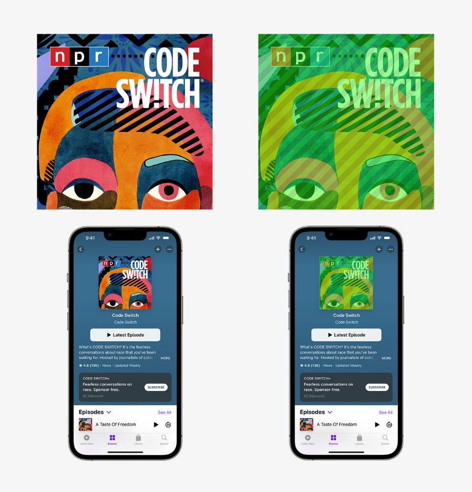
Google Podcasts, a popular podcast platform among Android users, also has the same or similar requirements for the podcast cover image. That is to say, you do not have to design a podcast cover exclusive to Google Podcasts.
Nevertheless, there are some platforms that have different requirements. For instance, Spotify mentions the following need for a podcast cover image:
- TIFF, PNG, or JPG format using loss-less encoding
- The highest resolution available
- At least 640px wide and tall
- Rapporto di aspetto 1: 1
- Codifica con spazio colore sRGB, 24 bit per pixel, applica direttamente il profilo colore.
Attenzione.: È importante ricordare di progettare copertine di podcast per tutte le piattaforme con esigenze diverse. Questo può sembrare scoraggiante, ma le restrizioni e le regole spesso scatenano la creatività di una persona. Inutile dire che se sei un podcast professionale e i tuoi compagni di squadra sono responsabili della produzione della copertina del podcast, puoi lasciarlo a loro.
2. Arriva al punto
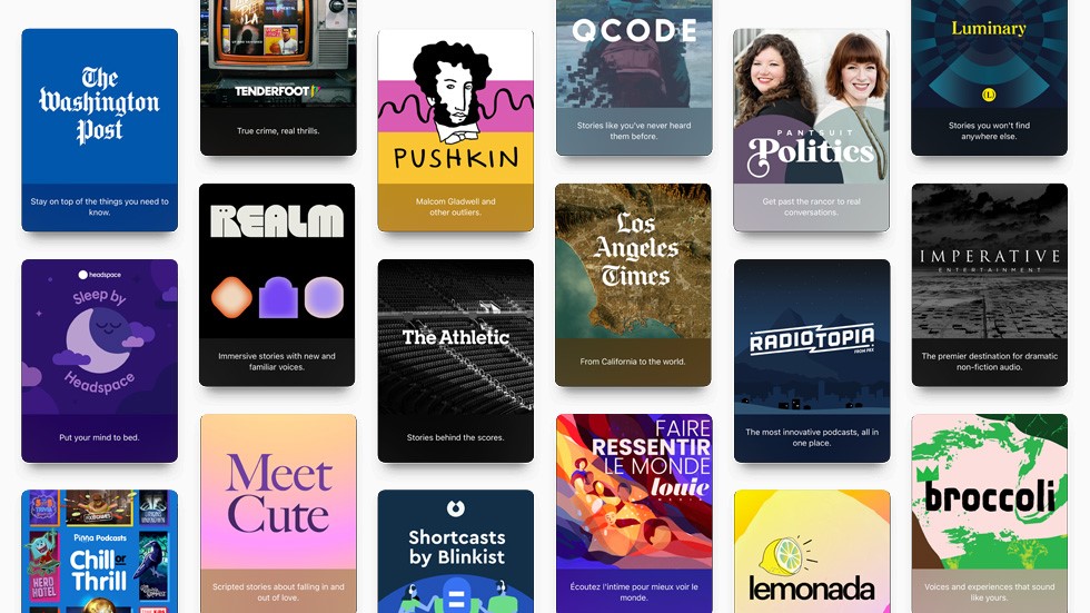
Le persone spesso confondono "arrivare al punto" con la semplicità e la chiarezza. Tuttavia, questa è un'interpretazione ingiusta di cosa significhi arrivare al punto. Inoltre, non è facile raggiungere la scala del "punto dritto".
In breve, "arrivare al punto" significa mostrare al meglio il tema del tuo podcast agli utenti che non hanno mai toccato il tuo podcast. Ad esempio, se il tuo podcast parla di film, non progettare semplicemente una copertina podcast con un grande logo.
Invece, fai brainstorming e scopri le differenze che incontri spesso nei podcast, come tipi specifici o serie di film. Una volta che hai ristretto il campo delle idee, puoi progettare una semplice copertina podcast, cioè che trasmette il messaggio in modo creativo.
Ecco alcuni esempi per aiutarti a pensare "direttamente all'argomento":
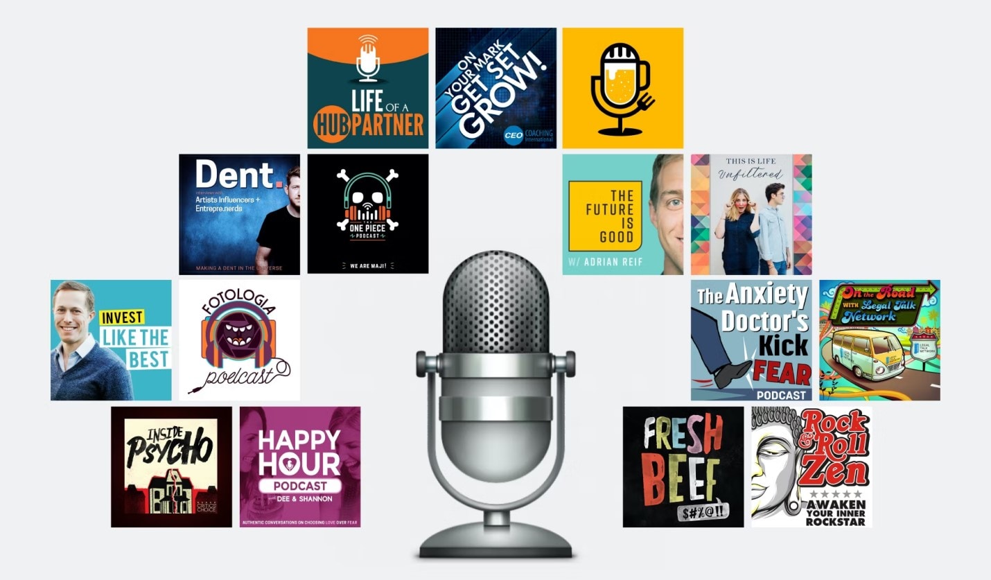
Esempio 1: agli imprenditori piace essere semplici, semplici e complessi.

The above podcast cover designs are related to business. If you carefully review each of them, you will find the human element. The human element is a necessary factor in business-related podcasts. It is what allows business professionals to connect with the experts and attracts them to the podcasts.
Another thing to review is the color palettes used by the entrepreneurs. The colors used in the podcast cover photos by hosts are often subtle yet bright and reek of sophistication.
Example #2 ― Comedians Making the Most from Their Podcast Cover Photos.

Comedy podcasts don’t seem like much, but they have a huge user following. Do you know how? Well, they attract users in bulk with their funky, impressive, and immersive cover images. Notice the clever use of colors on all the podcast cover designs. Moreover, the typography used in these cover images is also unsophisticated and often conveys that this isn’t something serious.
3. Avoid Inappropriate Words or Imagery
Swearing and inappropriate imagery is part of today’s taboo culture. However, it offends users. You have to retain that the podcast-listening community is an informed one. It’s not about becoming cool, but it's about delivering cool information.
Not to mention, using explicit languages is also restricted by podcast directories, like Apple Podcast and Spotify. So, you may also get banned for using offensive words or imagery in your podcast cover photos.
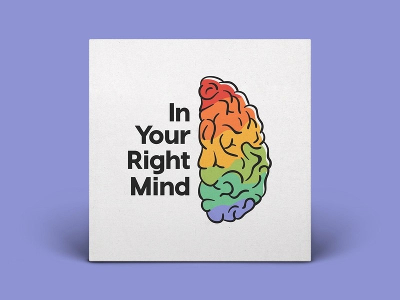
The recent policies of podcast directories like Apple Podcast have changed drastically. For instance, you could have gotten away with using asterisk marks in some words (like sh*t); however, it is not the case today. Your podcast will receive multiple notifications from the platform managers to remove the banner, and in some cases, the directories can also ban you from the platform. So, it is best to play it safe and use professional language, at least in the podcast cover photos.
4. Color Matters
Hay tendencias en el diseño de portadas de libros y películas, y luego vienen las tendencias en el diseño de portadas de podcasts. Te sorprenderá saber la cantidad de tiempo que cada podcaster pasa decidiendo el color adecuado para el arte de la portada.
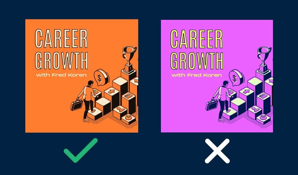
Color is something that not many businesses pay attention to, but it has a profound effect on users. To just give you an example of how deep businesses think about the color of their business, there is a separate domain after colors: color branding.
Yes, businesses spent a lot of brainstorming sessions to combine color theory and business. Here are some of the most prominent trends in the podcast world today and their significance:
Example # 1. Red background with light text
If you are into sales, you might already be familiar with the concept of red. Basically, red is the color of love, excitement, and anger. And the combination of these emotions allows businesses to create a sense of urgency among users. You can use the same psychology in the podcast world and let new users discover you through this psychological trick.
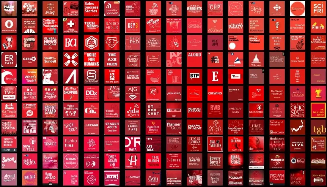
Today, almost all domains in the podcast world use the red color and combine it with black or white text to entice users about their podcast episodes. You can find such podcast covers on topics ranging from history to anthropology, psychology to music, and so on.
Example #2. Blue background with light text
Blue is the color of trust, competency, and quality. To loosely translate its psychological effects on an average human, blue creates a sense of dependability, logic, and peace. So, if your podcast is on medical topics or something calm, a blue podcast cover photo is the way to go.

There are numerous other examples like this. For instance, even black ink on a grey palette is a trend. After studying their psychological effects on your users, you can choose from any number of colors and combinations.
Lang: It is important to retain that color psychology is not about tricking people. Instead, it is about learning the effects of color on people mind’s and using one that best describes your episodes. So, research this in-depth and choose a color that resonates with your content and also impresses users.
Lang: 5. Typography will help
A debate that long started at the advent of the internet and is still continuing is the effects of fonts on readability. Some recent studies from Canva have revealed that fonts have a lot to do with readability. But most important of all, fonts have a huge effect on people’s emotions.
For instance, serif fonts have long been used in newspapers, magazines, and even web pages. That is why most users associate serif fonts with classical, nostalgic, and often professional or formal. And it is thus suitable when you are creating a professional podcast discussing business, education, and so on.
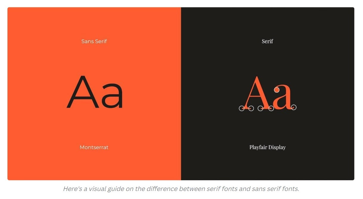
Sans serif is the new thing. It is all about throwing the tradition of using Serif fonts out of the window and using a fun and exciting and allowing users to read conveniently on the web-pages.
But typography does not mean it's all about the font itself. The size of the font, the spaces in between the fonts, and the color of the font all play a differential role. So, ensure to learn about all the intricacies of typography and accordingly use fonts, their size, the gap in between them, their color, and so on.
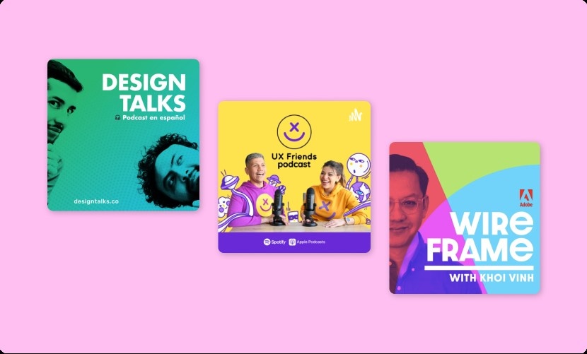
Additionally, you should focus on blending the typography with imagery. The combination of both often becomes messy and unreadable; of course, the creativity lies in
6. Unique and high-resolution images
A unique picture is what differentiates you from others. A user can easily locate and revisit your episodes if you use a unique-looking podcast cover. However, in addition to the unique design of the podcast cover, you should also ensure it is in high resolution.
Ricorda, qualunque cosa tu discuta nei podcast, le immagini ad alta risoluzione riflettono classe, professionalità e maturità. Allo stesso tempo, nell'era digitale, i podcast a bassa risoluzione sono inappropriati e non sembrano eleganti.
7. Brand consistency
Of course, A/B testing in the initial phases is necessary to test the design of the podcast cover. However, such tests are suitable for a short period of time. Ensure to spend enough time beforehand, so you do not have to change the design of the podcast cover often.
Brands like Coca-Cola, Nike, and Apple use consistency in their images and logos and ensure that all platforms have a similar brand image. This allows the users to recognize the brand, and the picture sits in the user’s mind. So, ensure consistency across all platforms and use the same cover images on all podcast directories.
8. Image compression
Almost all podcast directories will recommend you compress the podcast cover image, and for good reasons. Firstly, a small image loads faster on the pages and allows users to interact with your podcast at first sight. Second, mobile apps and web pages are very different in nature from web platforms. And a lot of users listen to the podcast via their smart phones, so it is best to use compressed images.
An ideal podcast cover art dimension is 3000 x 3000 pixels, which is a 1:1 aspect ratio.
Some podcast platforms, like Buzzsprout, do the image compression on their end. So, ensure not to compress the image beforehand, as this will further shrink the size of the image.
9. Design for a variety of sizes and re-purpose your art
When you design the podcast cover, it is best to take different aspect ratios and dimensions and sketch your plan. This will allow you to be more creative, and of course, you can easily resize the banner for respective podcast directories.
Bonus Tip: Make an Attractive Podcast Cover Easily with Filmora
अब जब आपको पता चल गया है कि पॉडकास्ट कवर आर्ट के लिए रंग, फॉन्ट, टाइपोग्राफी और सामग्री को कैसे चुनें, तो आओ देखते हैं कि इन सभी तत्वों को कैसे मिलाकर पॉडकास्ट कवर डिज़ाइन करें जो अनूठा, भिन्न और प्रभावशाली हो।
However, using an effective tool like Filmora to design podcast covers is important. Yes, there are hundreds of other tools for podcast cover design. But Filmora stands out, given it includes everything one needs to create an impressive podcast cover image.
Wondershare Filmora is an all-inclusive tool for designing impressive and unique podcast covers. Its stock library allows you to access premium content from sites like Pixel, Giphy, and its own film stock. It means you can choose from millions of images and create the most impressive podcast banner.
Also, this tool allows you to manage every aspect of the image and add text, photos, colors, graphics, and more to the podcast cover image. You will find options to control the topography, color correct each element on the podcast banner, and change the elements' size.
Above all, Filmora is a self-explanatory tool with a clean and modern interface that even beginners will find simple to use.
Key Features
- Use an image from the stock and customize everything. Add texts, photos, colors, graphics, and more.
- Supprimer l'arrière-plan de n'importe quelle image en un seul clic ; Filmora inclut un outil de suppression automatique d'arrière-plan basé sur l'IA.
- Utiliser des graphiques vectoriels et d'autres éléments pour rendre votre design exceptionnel.
- Personnaliser la couleur des textes, des éléments et des graphiques.
- Corriger la couleur de l'image.
- Exporter dans n'importe quelle résolution, format et dimension personnalisée (options dédiées disponibles).
Comment créer une couverture de podcast avec Filmora ?
Comme indiqué, Filmora est vraiment simple à utiliser. Que vous ayez déjà utilisé un outil de création de couverture de podcast ou non, Filmora sera facile et rapide à utiliser. Voici comment créer une couverture de podcast avec Filmora :
Etape 1Téléchargez et installez Filmora Video Editor sur votre ordinateur Mac ou Windows.
Etape 2Launch the installed app and click Create a New Project. Then, click Stock Media at the top.
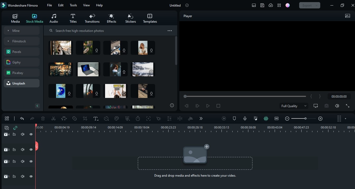
Step3You should see a list of the royalty-free image platforms that are supported on Filmora on the left side of the screen. Click a preferred platform (We used Unsplash for this stepwise guide.) and type Podcast in the search bar. Then, drag-n-drop a preferred photo that you wish to use for your podcast cover photo to the Timeline.
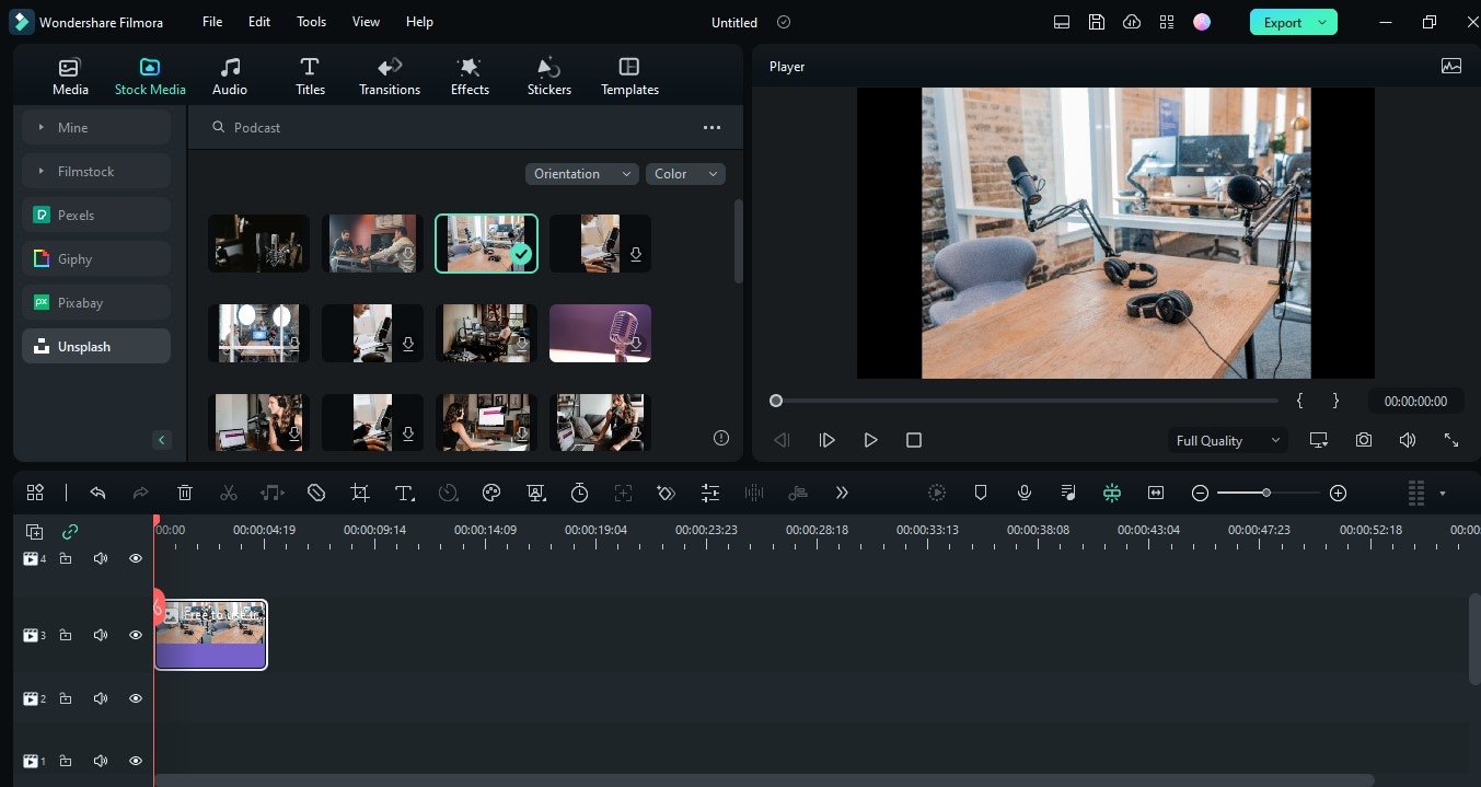
Step4Navigate to the top of the timeline and click the Text icon. Then, select Quick Text or 3D Text, depending on your requirements.

Step5A pop-up window should appear on your screen. Click Title > Basic > then enter the title of your podcast show in the relevant area. After that, adjust the font, font size, and text color. You can also make the text animated by clicking Animation at the top of the pop-up.
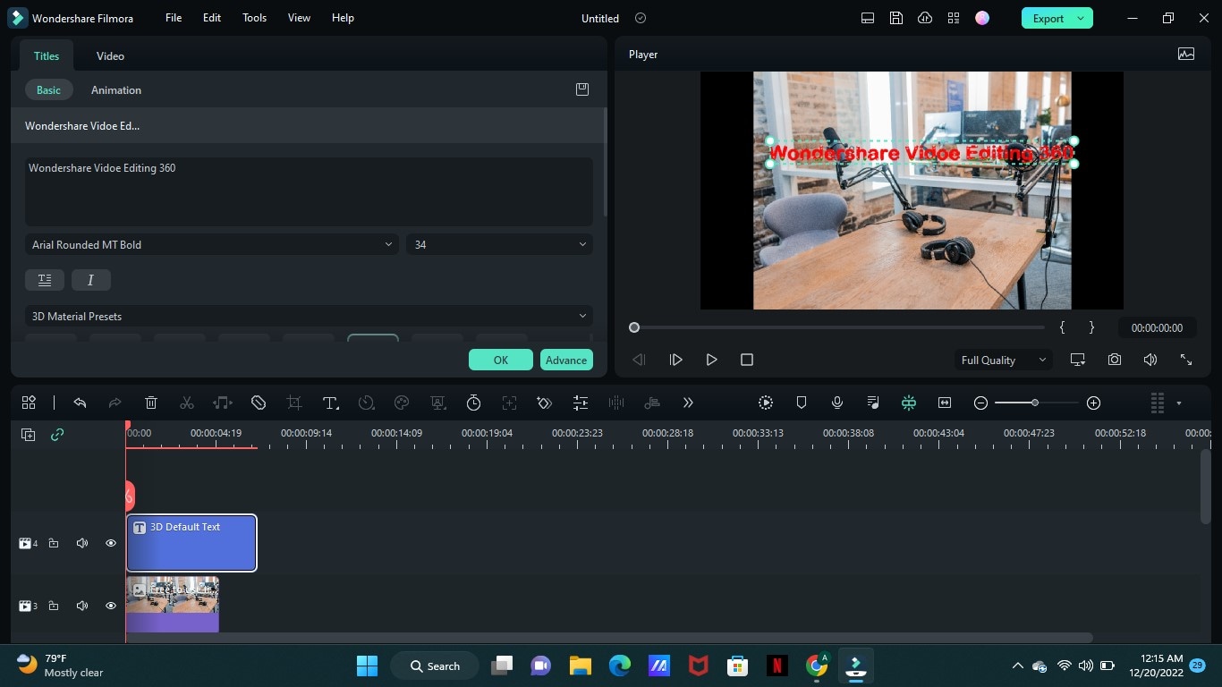
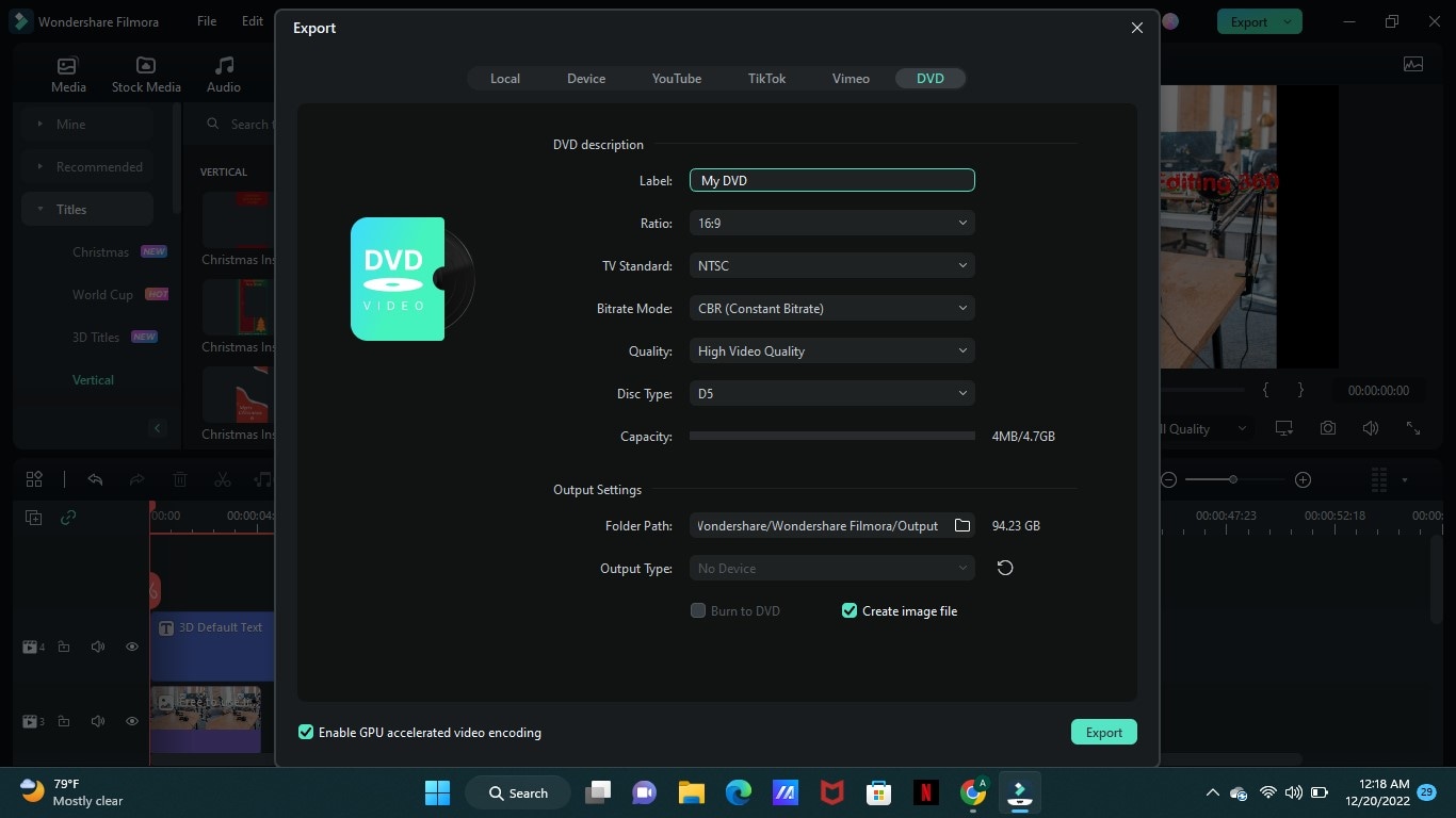
Step6Once you complete the settings. Click OK > Export. Then, from the pop-up that appears, enter the file name in the relevant area and select a preferred location to save the p[ocast cover photo. Then, click Export to finish.
Summing Up
Spero che tu sappia esattamente quali elementi dovresti gestire nella copertina del tuo podcast e come creare podcast con Filmora. Ricorda, non esiste una foto perfetta per la copertina del podcast.
Tuttavia, se gestisci tutti gli elementi suggeriti e li fondi in bellissime immagini, l'immagine di copertina del tuo podcast può superare la concorrenza.


 Garanzia di Download Sicuro, zero malware

